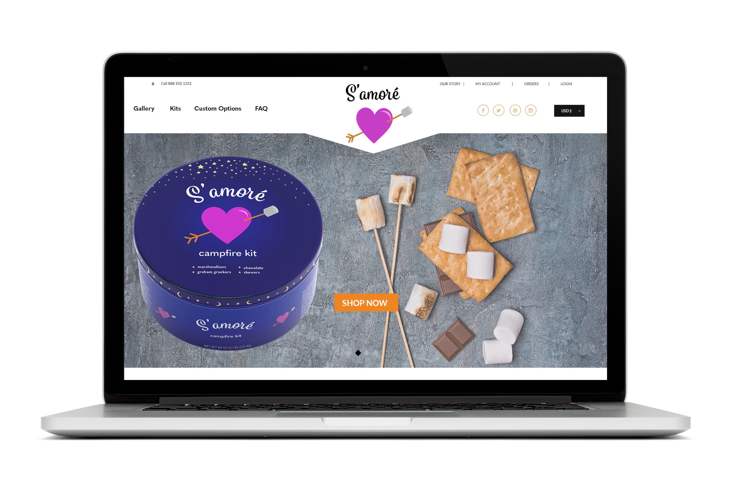
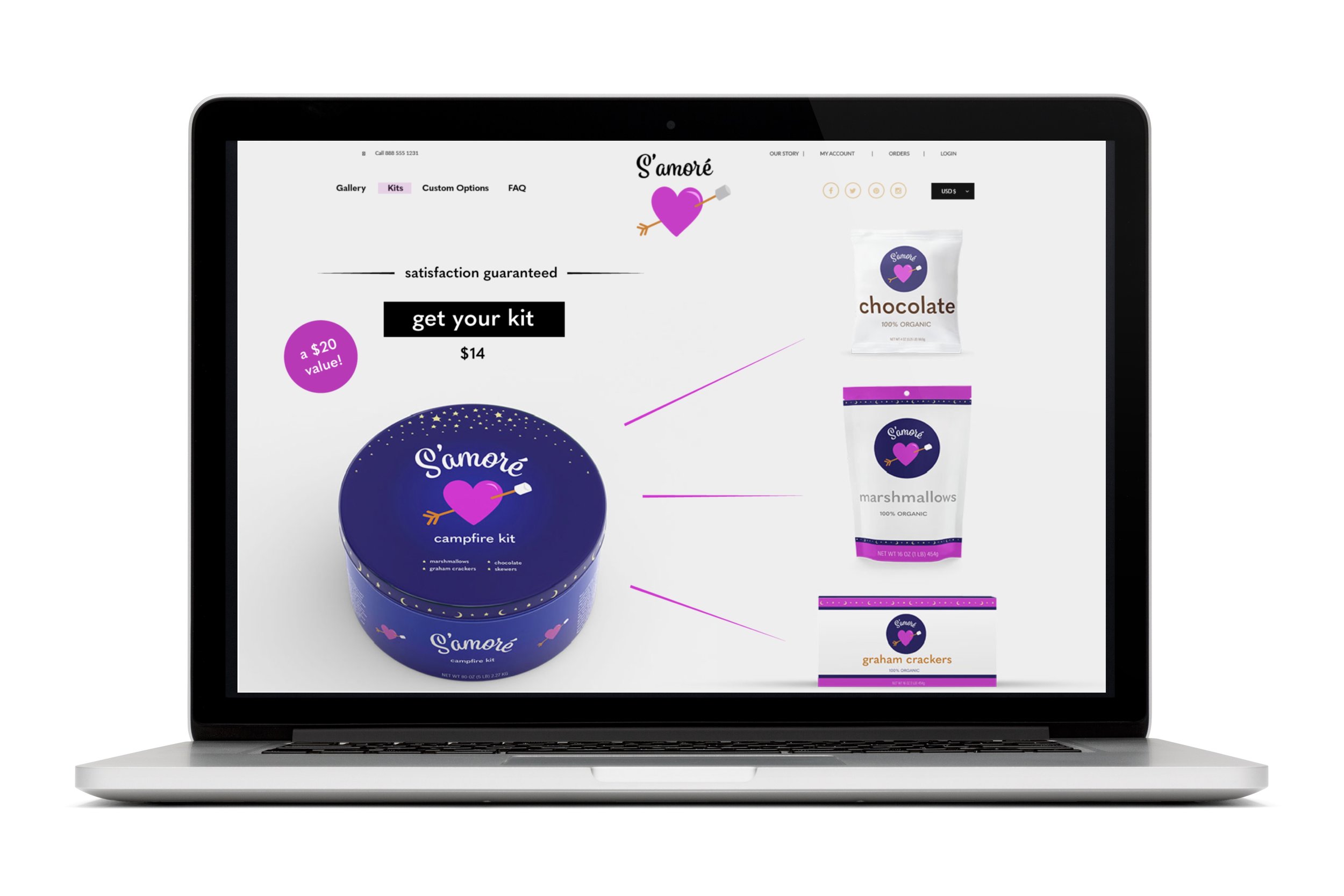
Logo and packaging design
Design Problem: Making s’mores around a campfire is one of the most memorable parts of a kid’s camping experience. Parents shop for the ingredients separately and end up bulky, inconvenient bags of all the ingredients to bring camping. I hadn’t yet seen a packaged kit with all these ingredients together in a fun package that could work as a gift.
Design Solution: I came up with the name “S’amore” to play off the word “s’mores” and combine it with “amore,’ which means love in several languages. I designed a playful logo combining a heart and marshmallow on a stick, with a fun loopy typeface. The product could be ordered online as a custom gift kit and contain add-on products like hot chocolate.
Audience: Parents of children age 4-12.
Software: Adobe Illustrator
Design Process
The logo itself has gone through many iterations. I originally made one that I loved, which had the word S’amoré written out as sticks. The heart had two sticks flanking either side like swords crossing, and the heart had flames coming out of it and roasting two marshmallows. I thought it was the cutest thing ever. I revisited the project a couple years later and showed it to a graphic designer who looked at it, paused, and told me it was a little scary for a kid’s product. I was not expecting that feedback, but it turned out to be super useful. I took the flames and the crossing sticks out and simplified it to it’s current form.
When I started this project, I also made my own packaging using cardstock and a dieline. It won an award in my class and I was really proud of it! But I knew all along it really belonged in a tin. I was excited to explore new styles of packaging design when I reworked this project for my portfolio and build out complementary products like hot chocolate, graham crackers, and marshmallows.


