

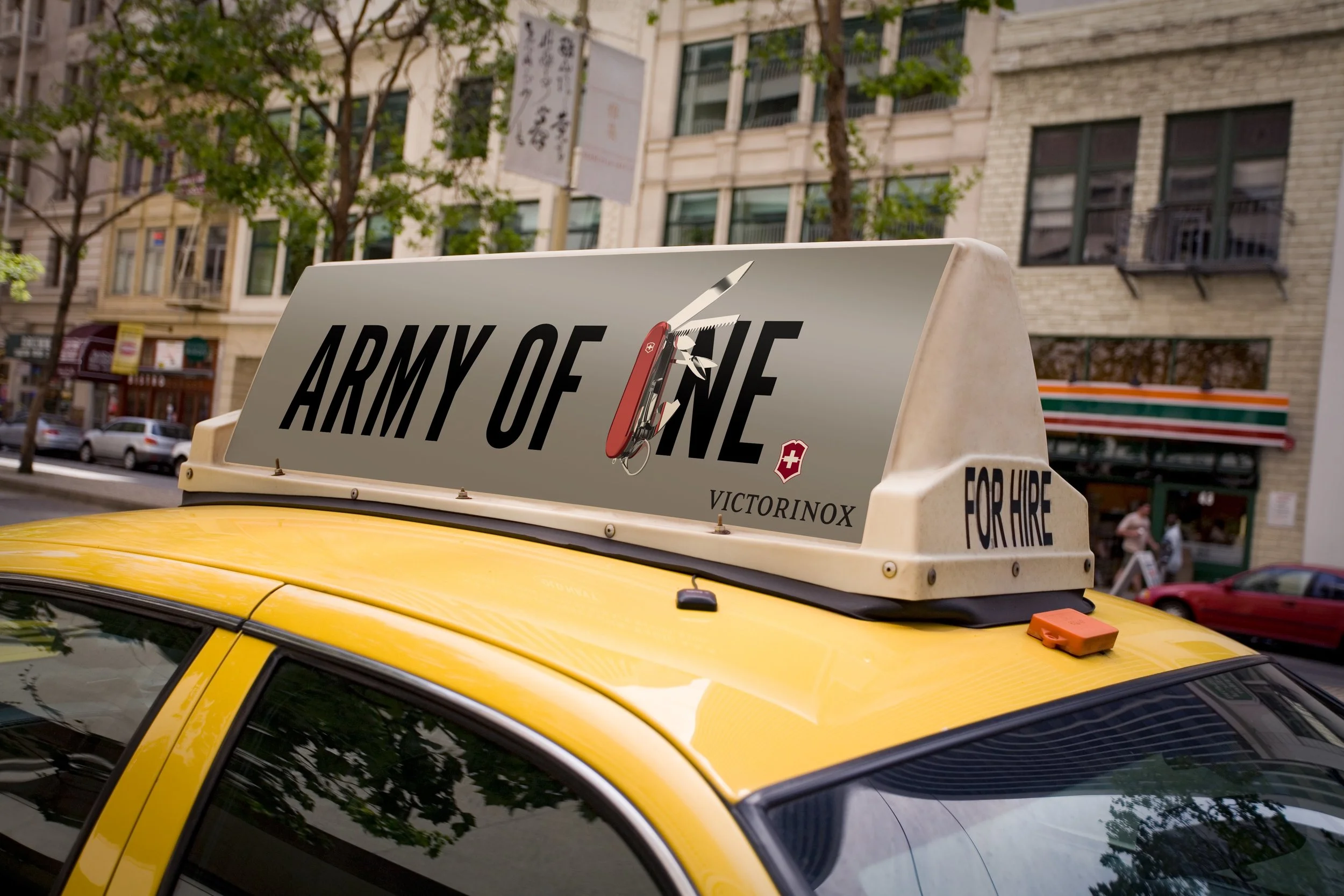
Design problem: The original intent of this project was to recreate a product in Illustrator and make it as realistic as possible. I chose the Swiss Army knife because of its reflective elements, multiple components, and simple color scheme. I realized that this is a one of a kind product, and even if other brands make their own versions, everyone still calls it a “swiss army knife.” I decided to emphasize the originality of the product in my ad campaign.
Design solution: The knife itself is the star of the ad, so I chose to make that the dominating factor of the ad, front and center, with very few other elements in the ad. It needed a catchy tagline so I chose my own. The ads are meant to show you how beautiful and seamless the product is, while emphasizing that there really is no other -- Swiss Army knives by Victorinox are the original. It's what your grandparents and parents have used for generations, and there’s a reason for that.
Audience: Young adults who consider themselves outdoors enthusiasts, handypeople, mechanics, and DIY types who have seen the product (perhaps their parents or grandparents owned one) but have never purchased their own before.
Software: Adobe Illustrator


Design Process
I spent hours and hours tracing images of Swiss Army Knives in Adobe Illustrator when I began this project. I was just learning how to use the software and wanted to make something hyperrealistic and reflective. The biggest challenge was revisiting this project later on and adjusting a million intricate vectors. From that day on I made sure to keep all my Illustrator layers very meticulously organized!
The typeface Alternate Gothic is strong and bold, which I thought reflected the ad campaign well. The three word tagline was designed to be loud, but not louder than the knife.

